
I've been to Yellowstone twice now, it's a very unique National Park with diverse areas to explore. I think the most striking and well-known thing about the park are the natural hot springs, colorful pools and geysers. Today I'm going to share my watercolor painting process with you for this painting of Turquoise Pond.
In 2017 my husband and I went to Yellowstone in the beginning of June for our honeymoon. We flew in to Bozeman, Montana and stayed in a lovely bed and breakfast near the border of Wyoming, about 45 minutes from the park. One day when we were driving in we got stopped for a while because a bunch of Bison decided to take a leisurely pace crossing the road. There is an incredible variety of wildlife at Yellowstone as well as a diverse biome. If you drive the whole loop around the park you'll sometimes feel like you've entered into a totally different place because the scenery changes so completely. My favorite parts of the park were the really colorful pools and the waterfalls, especially the falls in the Grand Canyon of Yellowstone.
Today I'm giving you a look into my process for Turquoise Pond, a beautiful pond that gave me some great contrasting colors to work with. Read on to the different stages of this painting from start to finish, the tools and materials use to create it and the specific paint colors I used.
Tools and Materials
Metal watercolor Palette - I love this palette because it folds up to a compact size, holds everything I need and it cleans up nicely.
Tape - This is the brand I use to tape down my watercolor paintings
I use Arches paper for all my paintings, usually 140lb cold press
Size 4 quill brush - Used for the sky and other large washes
Size 6 round brush - Used for a lot of the non-detailed parts of the wet on dry stage of the painting
Size 2 round brush - Used for trees and other small areas of detail
Size 2 fine detail brush - Used for sharp lines and fine details
Paint colors
The Process
I almost never use color straight out of the tube. I work with nature and realism, and to achieve a natural look you always want to at least add at least a tinge of another color to the one you are working with. Below you'll see my color swatches, I make one of these before most of my paintings because it helps me to be consistent with my color usage throughout the painting. I move around a lot in my painting so I might lose track of the paint color I mixed for the pond when I try to go back to it if I don't have it written down that could be really hard to try and figure it out. Better to just be organized from the start!

As I do in every landscape, I started by painting the sky. This one is not on that swatch paper because it's one of my common sky mixtures: Manganese Blue by M. Graham mixed with a little bit of Buff Titanium. Here's a quick tip for painting watercolor skies. Don't try to paint the sky around uneven parts of the landscape like trees. Instead wet the paper over those objects on the horizon. This way your sky will fade nicely into the horizon and you can simply paint those trees and mountains on top of the sky. This looks much more realistic because you avoid creating a sharp line where the paint of the trees and the sky butt up against each other.
I used paper towels to pull out some whites from the wet sky and get those thin, wispy clouds.

My first pass over the landscape is wet on wet. After painting the sky I applied blockout to some areas that I wanted to remain white, and wet almost the entire lower two-thirds of the painting excluding the pond. I tried to be really free and loose with the colors to capture those pools of burnt orange and tan. Then I did an initial blue on the pool with the color Cobalt Teal Blue; I wanted this color to stand out so I did the initial wash straight out of the tube.

.In the next photo you can see I've started painting mostly wet on dry. I still do some small washes of wet on wet like in the dark blue/grey lines.
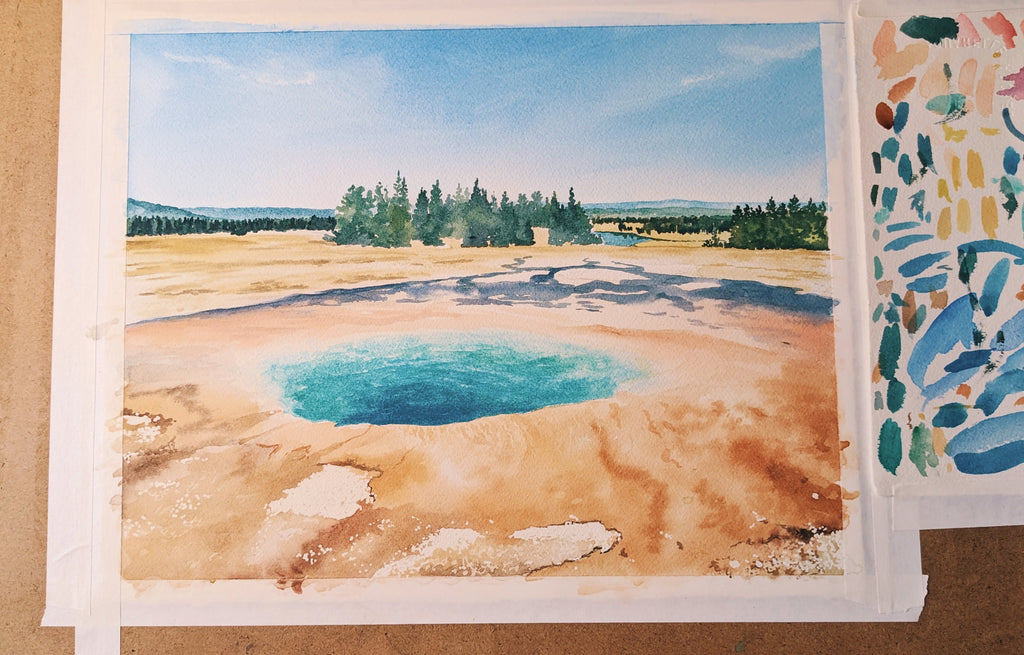
I'm getting close to the finish line here. You can see I'm just adding layers of darker color on top of the colors I've already laid out.

 Here's what my work area looks like as we're nearing the end here.

And here is the completed painting!

Thanks for following along, I hope that you learned something or just enjoyed seeing my personal watercolor process. This painting is now for sale in my online shop, you can see it right here.
The links in this blog post are affiliate links to Amazon products. Thanks for your support if you choose to purchase something through my links!